Have you ever been to a modern art museum? It can be a very interesting experience, but it is definitely not for everyone. It requires a certain depth of mind and openness to be able to appreciate art that, to the untrained eye, looks like paint splatters. Minimalism in cover design is a similar experience. You have a cover that is white, with black text set in helvetica on the bottom corner, and you wonder, where is the rest of the design? Minimalism can be a very powerful tool in a designer’s arsenal, however. If you are trying to depict the concept of loneliness, for example, have a stark white cover with simple text in the corner can convey that idea more eloquently than any image.
Following is ten minimalist book covers that did exceptionally well with the concept of “less is more.” All designers are noted unless I don’t know who they are. If you know the name of a designer please put it in the comments, I like to give credit where credit is due!
1. 1984 by George Orwell

This cover’s simple brilliance in using typography to convey the idea of “Big Brother” and that creepy feeling of always being watched is extremely effective here.
2. Look Who’s Back, cover design by Johannes Wiebel

Whatever you think of the book itself, which is a comedy about Adolf Hitler (!), the minimalist cover design is fantastic. How many other people can be identified only by the hair on the head and face?
3. Against Happiness, cover design by Jennifer Carrow

The yellow background cover, together with the curve of the title make a compelling visual that conveys more about the subject than a more complicated image ever would.
4. Loneliness, cover design by Peter Mendelsund

This is an oldie but a goodie. The lonely dot from the i gives you a strong sense of the isolation that the book discusses.
5. Redesign of Dracula, cover design by Steve St. Pierre

How little can you get away with putting on a cover and still convey your message? This redesign of the classic novel Dracula manages to do it with only two dots. Inspired!
6. Girl in the Dark, cover design by Greg Heinimann

Without even reading the synopsis, you can tell a few things about this book just from the cover: it’s dark and creepy, and it’s a true story. On reading the summary, we see that it’s about a girl with a severe skin condition that forces her to live in the dark. So the cover is actually very apt – a dark room with the light coming in from a crack in the door. Minimalism at its best!
7. Curiosity, cover design by Sonia Shannon

This is fabulous – so simple, but says everything it needs to say. The contrasting colors, the question mark as the C, and the white space make this cover appealing and impactful.
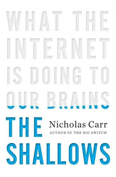
8. The Shallows, by Nicholas Carr

This one never gets old. All type, hardly any color, yet the cover conveys its message with perfect clarity.
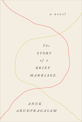
9. The Story of a Brief Marriage, cover design by Janet Hansen

I love this. Two threads, intersecting for a brief period of time and then going their own way. Simple, yet effective.
10. An Ethics of Interrogation, cover design by Isaac Tobin

Have you ever seen those old films where the police conduct an interrogation? There is always a lone lightbulb – always. It’s a thing. This nonfiction book about the ethics of interrogation practices utilizes that old stereotype to great effect to create a gloomy, dark cover that hints at some of the dark sides of interrogation.
Do you have other minimalist covers you love? Post them in the comments below.
FREE DOWNLOAD
The Author's Guide to Working with Illustrators
Learn everything you need to know about hiring and working with illustrators for your next book.

