On my first day of second grade, my english teacher handed out our grammar textbooks. I idly flipped the book open and saw an enchanting image of a little mouse having a party with a very long word I could not pronounce written underneath it. I concentrated, trying very hard to sound out the strange word: S-U-R-P-R-I-S-E. When I finally figured it out, I had a eureka moment that made me want to read the whole story, and my love of books was born.
Seeing how art and books were my first two passions, designing books came somewhat naturally for me. I got my first book design job in 2001 and have enjoyed designing book covers ever since. So, what makes a good cover? I have been thinking about this for a while, and here are three main points about cover design that I think are important to keep in mind.
It’s all about communication.
When I say communication, I am referring to communication on multiple fronts. First, and most important, is communication with the client. Keep in mind that this is not always the author. Sometimes, this is the publisher, and they may have slightly different considerations for the cover than the author does. For an author, a book is a labor of love. If you think of a book as their baby, they create the soul, and it is your job as the designer (and this applies to typesetting the insides, too) to give that baby a physical form. So make that baby beautiful. Be considerate and kind when dealing with authors because they often have poured their hearts and souls into this book.
Related to this, your first step should be to see what they expect. A publisher usually will consider sales before he will consider the author’s feelings, and I have often found myself in the position of being a buffer between the two. Speak to both the author and the publisher and find out from both of them what they expect, if they had anything in mind, and what they feel the main takeaways from the book are.
And this leads us to the second part of communication. The job of the book cover is to communicate an idea. You need to read the book, if not the whole book, at least enough of it so you can get a feeling for the tone, the language, the main ideas, and the heart behind it. Take notes while you are reading, and use those notes as a springboard to start drafting concepts when you are ready. The more you get into the book, the better the cover will be.
Genre is important.
People have certain expectations when it comes to book covers. If you use a digital looking type of font, with glowing light blue sabers exploding all over the cover on a starry black background, it will be jarring and unpleasant for the reader to realize that it is a romance novel, even if the romance novel takes place in space. Each genre has a certain set of unspoken rules associated with it, and following those rules, even loosely, allows readers of that genre to be drawn to the cover and to pick up the book, which is the goal, after all.
Before you start designing, research popular books in the genre and pay attention to design trends, repeating elements, and what makes certain covers jump out at you and others recede into the background. Look for books similar to the one you are doing and see how the cover designer dealt with the subject, and this will help you form your own ideas that will be simultaneously original and true to form.
It should catch the reader’s eye.
In our world of burgeoning digital content, ebooks and online shopping is the norm rather than the exception. While brick and mortar book stores are still around, and nothing can replace their charm, more often than not your book cover will be viewed by a potential reader who is scrolling through Amazon looking for a book that catches they eye. You can bet that they are not reading every description before they click on the book. They stop and click on a book cover for two main reasons: the title, and the cover design.
I find it helpful to think of a book cover as a promotional poster for the book’s contents. People are walking past, and you have 0.2 seconds to catch their eye before you’ve lost them forever. So it should be uncluttered, with a clear message and a legible title. This doesn’t mean that there is no room for covers with multiple elements or fabulous typography – some of the best covers out there take all these rules and smash them to pieces. What it means is that you need to make sure that your main message is available to the reader at a glance. What is the genre? What is the feeling they will get from the book? Can they read the title and author’s name? Everything else is extra. You will not be able to convey everything about the book in one cover image. Paring down the message to the core element or elements that best represent the basic ideas presented in the book is the surest way to create an effective book cover that will catch readers’ attention and have them pulling the book off the shelf – digital or otherwise.
FREE DOWNLOAD
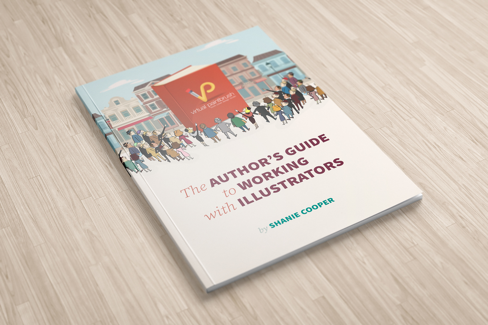
The Author's Guide to Working with Illustrators
Learn everything you need to know about hiring and working with illustrators for your next book.

