I love reading out loud. No, not to myself. But I am not so discerning about my listeners – I truly believe that nobody is too old to enjoy a good story. My sons are teenagers, and my fifteen-year-old will not allow me to see that he listens to my stories, but my thirteen-year-old son still openly embraces being read to.
I recently introduced him to the magic of Harry Potter. We just finished reading the first book, as an ebook, and I went off in search of the next couple of books in print format. We ended up borrowing them – we borrowed book two from a Briton, and book three from an American. Why is this relevant? Well, because the US and the UK both have separate printings of the book. The UK version was printed by Bloomsbury and the US version by a division of Scholastic. When I looked at the two books, the differences were astounding. Now, keep in mind that I am American, so this may have swayed my opinion here, but there were key differences in the design and layout of the book itself and the text that I want to discuss.
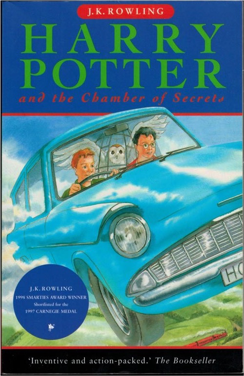
Here is the UK version of the second book, Harry Potter and the Chamber of Secrets – the cover and one inside spread:


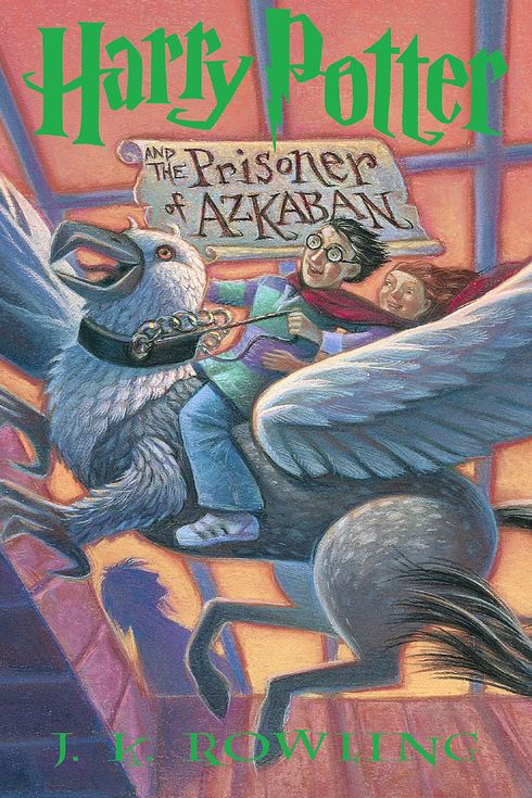
And here is the US version of the third book, Harry Potter and the Prisoner of Azkaban – the cover and one inside spread:


Both of these are the first editions – printed in the late 1990s. So in terms of design style, etc – the designs are contemporary to each other, and both targeted the same audience, albeit in different countries.
The UK design is pretty straightforward. The cover design is very linear, the illustration is pretty standard, and the title font is a very functional serif. The inside pages have no illustrations anywhere, not even at the beginning of each chapter, and the whole book is laid out in the same serif font. The margins are very small, the line spacing is narrow, and the pages feel dense and packed with words. The whole thing feels very standard and functional, almost like a textbook. The words themselves provide the entertainment, but the design is just “there” – it doesn’t really add anything.
The US version is a whole different story (clearly, I have a bias!). There is nothing linear about the cover at all. The title is written on parchment and is part of the design, the layout is dynamic and interesting, and the illustration is wonky, fun, and colorful. Harry’s name is written in a font so unique that it has become an icon on its own. Show anyone the “P” from his name on the cover and they can instantly tell you where it’s from.
 The inside pages have fun illustrations at the beginning of each chapter. The page numbers and headers have stars speckled around them. Each header and page number is laid out in the title font. The font is larger, more spaced out, and has more space between each line. There are drop caps. The margins are triple the size. The whole reading experience is different in the US version. Before you read a word, you get the sense that you are about to embark on an adventure. And as you progress in the book, these small details that seem insignificant contribute towards making the whole reading experience that much more magical.
Now, to be fair, the UK version is in much better physical condition than the US version. Both are hardcovers, with the UK version being printed in 1997 and the US version in 1998. So the books are about the same age, and the UK version is in basically perfect condition, and the whole US book is falling apart – the binding is unraveling. So you can’t discount a good printer and binder.
That being said, you also cannot discount a good design. While Harry Potter would be a success written on notepaper, a good design contributes greatly towards making the reader not only enjoy your story but enjoy the book. A good design, coupled with a fantastic story, is what makes you want to sink into the book, smell the pages (am I the only one that does that?), and read it again and again.
Do you agree? Disagree? I’d love to hear what you think in the comments below.
FREE DOWNLOAD
The Author's Guide to Working with Illustrators
Learn everything you need to know about hiring and working with illustrators for your next book.

