
Remember when you were little and your parents made you really angry, and you threatened to run away? My own kids did it too, and I always laughed – where exactly, did the four year old plan to go? The Day I Ran Away is a picture book from Flashlight Press that explores this important dilemma.
Creating a picture book is a long process that involves many talented people, including, but not limited to, the author, illustrator, editor, publisher, copyeditor, and graphic designer. This case study is by no means a comprehensive look at the complete process, but merely a peek at my (the graphic designer’s) role. The team that worked on this book, The Day I Ran Away, included the author, Holly Niner, the illustrator, Isabella Ongaro, the publisher, Tzvi Mauer, the editor, Shari Greenspan, and myself, as the designer. The book was loads of fun to work on and has bright, quirky illustrations that really bring the story to life.
The first step in any picture book is always the story itself. I am always less involved at this point – this process usually happens between the editor, author, and sometimes, the publisher. Many times I will read the story when it is edited and more developed and give feedback, but that is more because of my undying love of the written word, and less because of my role as a graphic designer.
After the story is more or less done, the process varies from this point. Different editors proceed differently, and even the same editor might approach each book in a different way. In this particular case, the editor found the illustrator on her own, and came to me with some ideas of layout, but we played around with layouts together before even approaching the illustrator with sketches, so we could see what worked for the story. The story itself is unique in the sense that it is one long conversation between Dad and Grace, with no narrative in between. The basic story takes place in two places – Dad and Grace sitting on Grace’s bed that night, with the little girl telling her Dad the story of her bad day and how it turned out. Grace’s bad day, however, centers around Mom. So you have, on the one hand, Grace and Dad in her bedroom, but you have the actual story of the day, with Grace and Mom, on the other hand. we had a to figure out a way to show both without confusing readers and without adding extra words to the story. This book is geared for young kids, so the fewer words the better, and we didn’t want to take away from Dad and Grace’s conversation, which is adorable and part of the book’s charm.
The book is square, and our first idea was to have Dad and Grace’s conversation be in the center of each page, with the illustration of dad and Grace along the top of the spread, and the “action” – Mom and Grace – along the bottom of the spread, something like this:

But that clearly wouldn’t work – the space along the top and bottom of both pages is too narrow to show any real action.
Our next idea was sort of fun and interesting (at least I thought so!), and the editor and I had a lot of fun daydreaming about it, until our very practical publisher yanked us out of the clouds with practical concerns like logistics. Anyway, at one point, Grace goes outside to her backyard to go camping while she runs away. So we thought it would be fun if the book opened vertically instead of horizontally, and then the closed book could be the tent:

Cute, right? But the idea was nixed out of practical concerns – How will the dust jacket not fall off? How can we do this without it costing a lot of money creating a custom cover? What happens with the pages – they just hang there? How will people figure out that it is meant to be a tent? And, most important of all, a 10×10 inch book that opens vertically is going to be really unwieldy and hard to read to your kid before bed.
In the end, we decided on a horizontal layout, with the text at the top. At that point, the editor started working with the illustrator on sketches and storyboard. Our first few layouts had the text along the top, with Dad’s text in one color, and Grace’s text in another color. The images were quick thumbnails sketched by the illustrator to help us work out the flow of the book, and to help her with figuring out which illustrations were working and which were not.
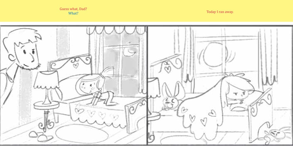
This layout wasn’t really working for any of us. The bar across the top felt static, and we thought it might be confusing for readers to follow along with the book if both scenes (Dad’s conversation with Grace on the left, and the “action scenes” with Mom, on the right) were given equal weight. So the next step was removing the yellow bar, and putting all the text on Dad’s side, and shrinking Dad’s images to spot images, and having Mom’s take up the whole page, without any text.
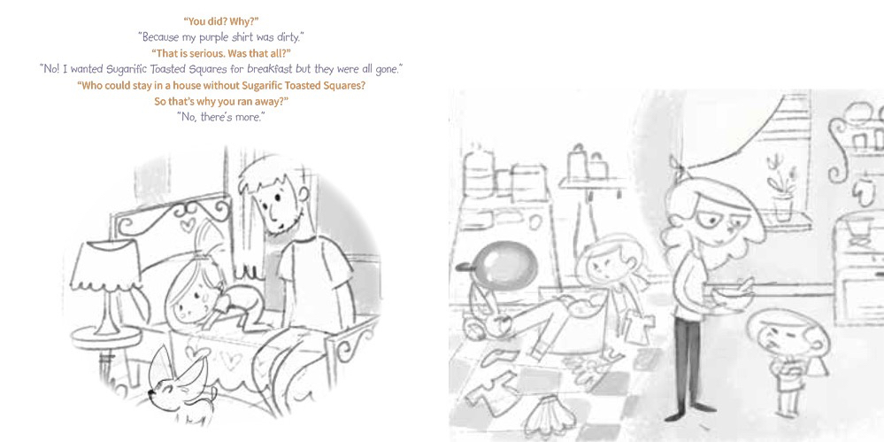
At this point, we also began to play with having one font for Dad, and one font for Grace. Our goal was to make the book as “user-friendly” as possible, with readers intuitively understandng what was going on, even without the clues in the text like “he said” or “she said.” The editor went back to the illustrator with our ideas, and she revised her sketches. The final sketch stage ended up looking like this:
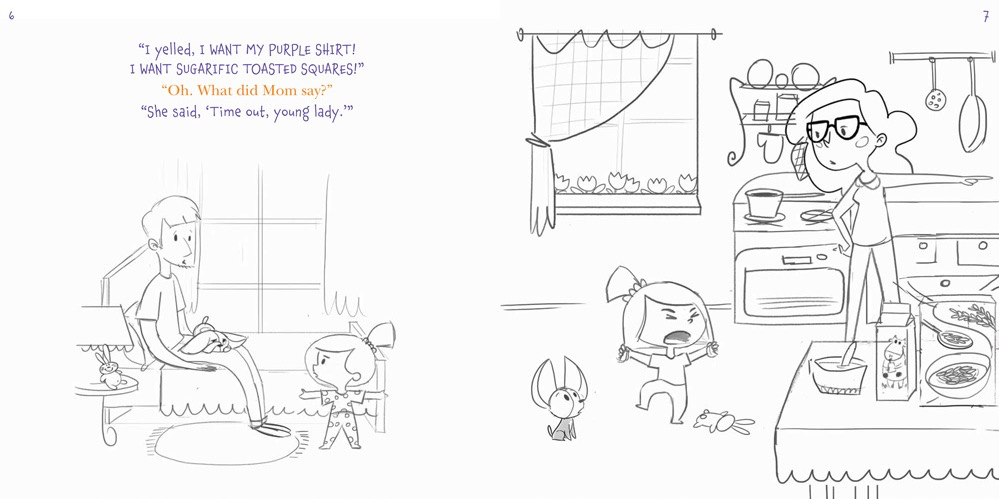
We changed the fonts at this point, also. Up until now, I had been using placeholder fonts – Source Sans Pro for Dad, and Kidprint for Grace. While I love Source Sans Pro, I felt that a serif font would be more appropriate for Dad – it would give his words more authority, and would also provide more of a visual contrast to Grace’s font. Kidprint needed to be changed because the font was way too overused. We decided on Chaloops for Grace, which is an adorable, whimsical font that comes in several weights, and New Baskerville for Dad – a classic, versatile font that gave us a little added gravitas for Dad.
From that point on, things moved pretty smoothly. We ended up with 48 versions of the layout before we went to print, but most of the changes were small – playing with full bleed versus a white border on Mom’s pages (we went with a border in the end), small text changes that enhanced the flow of the story, and mostly, illustration changes (like how the editor noticed the milk carton sometimes said Milk and sometimes did not – making sure the kitchen layout made sense with the other drawings of the kitchen in the book – playing around with the items Grace puts in her wagon when she runs away, etc).
This was the final layout:

In my next article, I will discuss the cover, and how we integrated that into the title page. As always, I welcome your comments.
FREE DOWNLOAD
The Author's Guide to Working with Illustrators
Learn everything you need to know about hiring and working with illustrators for your next book.
So fun to read this! As the author I knew some of the discussions, but not the details or how many versions of the layout there were. I do know that I LOVE how it turned out and so appreciated being able to comment on things as they proceeded. As I talk with people at schools or book events, they really have know idea the number of talented people that work on a book. Thank you Shanie, for helping to making The Day I Ran Away such a wonderful book.
Thanks for this behind the scenes look Shanie! The details really do make a difference don’t they? The font choice, to bleed or not to bleed, where to place the text… Can’t wait to see the thought process behind the cover.