You know that feeling you get when you see a stunningly beautiful book cover, and your heart skips a beat? No? Maybe its just me, then. In any case, typographical covers do that to me. I find letters to be intricate, beautiful little geometric works of art, and some artists are able to take all those gorgeous letters that make up the words of a book title and really make them shine in spectacular fashion. Here are 10 covers that I love, in no particular order.
1. Tomorrow I’ll Be Brave, by Jessica Hische

I had to start with Jessica Hische, because she is, arguably, the queen of typography. I have been following her work for a while, and when I saw she put a children’s book, I immediately put it on my wish list. Stunning lettering + children’s picture book = gorgeous feast for the eyes that I plan to enjoy.
2. The Age of Perpetual Light, by Josh Weil; design by Nick Misani

This cover is really beautiful. I love how the words themselves are part of the illustration, and give you a real feel for the idea of perpetual artificial light.
3. Can’t Stand Up for Falling Down by Allan Jones; design by Greg Heinimann

I love this because the letters are so recognizable as old fashioned vinyl records. Even before I read the subtitle, I knew that this book was about music. That is a successful cover, in my mind! Gets your attention, pulls you in, and tells you what it is about, all in about ten seconds.
4. Sick to Death, by Greg Levin

I could not stop looking at this cover. The startling creepiness of the title created by a finger writing in the crushed powder of pills makes for an arresting image that makes you wonder about the desperation of a dying patient and what he will be driven to do.
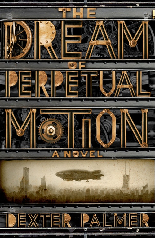
5. The Dream Of Perpetual Motion, a novel by Dexter Palmer

This cover is awesome. The letters and gears, along with the muted colors and vintage photo, evoke a feeling of nostalgia and motion, and the industrial revolution – steam trains, ingenuity, and a time when the world was moving forward at a breakneck pace.
6. Against Happiness, by Eric G. Wilson

How often do you see such a simple cover that expresses everything it needs to without a single image? This cover does that, and more. So, so simple, and so, so, effective.
7. Franny and Zooey, by J. D. Salinger

These are two short stories published by J.D. Salinger (Catcher in the Rye) in the 1950s. I don’t know if this cover was actually used, or was just put together as a creative exercise, but I love it. Have you ever tried to write with used matches? I have, and it looks exactly like Franny’s name. You need a ton of matches to make any clear marks, and it is always in danger of disappearing. I love the contrast to Zooey’s name, which is darker and more substantial. It clearly mimics the story, where Zooey tries to save his sister Franny from breaking down and fading away.
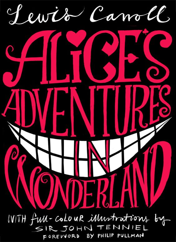
8. Alice’s Adventures in Wonderland, by Lewis Carroll

I love this rendering of this cover. It is so wonky, with the handwritten text, the cheshire cat smile, the subtle references to the queen of hearts, and the general chaos really characterizing the novel.
9. Eat, Pray, Love, by Elizabeth Gilbert

This cover is very cool. Having the text made up of elements that relate to the words themselves is a really creative, interesting take.
10. The Dinner, by Herman Koch

I love this – I think it really reveals the sordidness that sometimes lies beneath the surface of genteel society, and alludes to what happens when you burn it away.
This is by no means a comprehensive list – there are tons of gorgeous typographic covers. These are just several that caught my eye. Enjoy, and if you have any comments, or any others to add to the list, I’d love to hear about them.
FREE DOWNLOAD
The Author's Guide to Working with Illustrators
Learn everything you need to know about hiring and working with illustrators for your next book.


Love, love, love! My faves are the perpetual light and perpetual motion ones. Maybe also because those books sound so interesting. Here I am, judging these books by their covers (and their titles).
Great collection!
I especially admire the effort that went into creating The Dream Of Perpetual Motion.
Unfortunately some clients don’t understand how a simple cover says it all and gets the message across. I told a client once, that someone should be able to look at your cover from across the room and know from a glance what its all about.
The other option is to create something intriguing that makes one stop and wonder – but it doesn’t really make you want to buy such a book.
Here’s a challenge: I had to design a cover which the author requested should portray the struggle of guarding one’s eyes and its spiritual conquest.
You can see my try at it on my home page: sefarim.club