I happen to be one of those nerdy people who love history. When I walk into a bookstore, I am always torn between books like The Rise and Fall of The Third Reich on one side and Harry Potter on the other. Most people, however, groan when they see a history book. Suffice it to say, then, that designing historical books can be quite challenging. Here are 10 of my favorites, in no particular order:
1. The Brief History of the Dead

I adore this cover. I know that makes me sort of morbid, but come on! It is so brilliant I wish I designed it myself.
2. Worrying: A Literary and Cultural History

I love this cover because it says so much without being obvious about it. It really encompasses the fractious nature of worry and the way it accomplishes nothing, but chips away at us anyways.
3. Beneath a Scarlet Sky

This is labeled historical fiction, but is entirely based on a true story, so I’m including it. Besides the book itself being a fascinating look into WWII Italy, the cover is breathtaking. The red coloring gives the cover a very ominous feel, but the stunning landscape gives you a clue as to how the protaganist feels about his beloved country. The result is a cover that is striking and appealing to many different audiences.
4. Empire Rising

This is one of the books on my TBR (To Be Read) List, not least because of its beautiful cover. It’s about the construction of the Empire State Building. I have just one word here: TYPOGRAPHY. The compelling imagery helps too 😉
5. Chicago: A Biography

I really like this cover. I love the way the type and the image interact with each other, and the monochromatic theme and font choices feel classic and nostalgic. I also love the use of white space here, it really pulls your eye down to the buildings, and gives this feeling of CHICAGO rising from the fog.
6. Making the Climb

I like this cover because it is so tactile. Don’t you feel like you want to touch it, see if your fingers will get dirty? It expresses itself so beautifully. In this case, a picture really is worth a thousand words.
7. Dry: A Memoir

This is a memoir about an alcoholic’s time in rehab. I like how the designer only used type on this cover, but still managed to convey the feeling of fraying at the edges that characterizes so many addicts.
8. The Last Jew of Treblinka

There are so many holocaust books out there that it is difficult to make a cover that is going to make people look twice. But this cover manages to be compelling, yet respectful. The empty tracks are creepy, but the typography and coloring is classic and well done, paying respectful homage to a difficult time in history.
9. Accused: British Witches Throughout History

This cover is great because it looks like a novel. It makes you feel like you are going to be reading a creepy witch story – which you will be, only it’s a true creepy witch story. Slightly grungy effects on the classic serif font, and the washed out edges round out the cover of this historical account of people accused of witchcraft in British history.
10. The Paper Trail

I know I just said this above, but I really love tactile covers. 3D art, especially paper cuts, fascinates me – the detail, the way every part of the illustration needs to interact just so – it’s incredible. This is a history of paper, with the cover made of – you guessed it – paper cut outs. Amazing! No pens, pencils, or paint needed here.
Do you have any covers that inspire you? I’d love to see them – post it in the comments below.
FREE DOWNLOAD
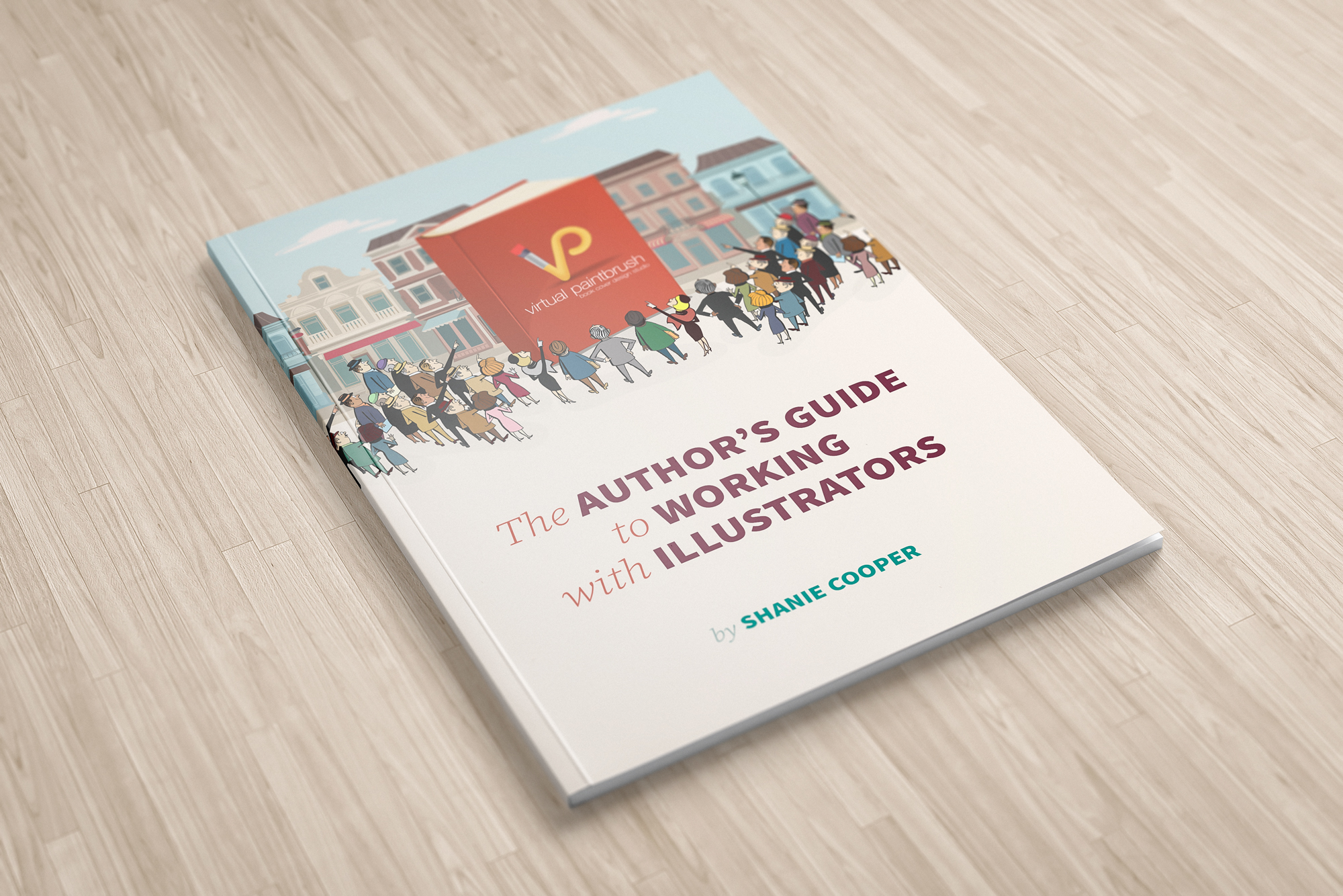
The Author's Guide to Working with Illustrators
Learn everything you need to know about hiring and working with illustrators for your next book.


I am really loving the theme/design of your site. Do you ever run into
any internet browser compatibility issues? A handful of my blog readers have complained about my site not operating
correctly in Explorer but looks great in Firefox.
Do you have any ideas to help fix this issue?